Final Product- Music Video

Saturday 19 December 2009

Photoshop- Finishing my Front and Back covers

During today's session I aimed to finish my front and back covers. After uploading my photos taken of my band and necklace, I edited them in Photoshop. For the necklace I used the 'Magic Wand Tool' to take out the background of the photo and just have the chain and pendant. I placed the finished image on the top of my back cover.
For the long shot of the band I used the 'Magic Wand Tool' to take out some background however I couldnt use it for the whole of the image so I used the 'Quick Selection Tool' and change the 'Tolerance' of the tool so I could take out smaller parts to the background. Once I just had the two members of my band I then changed the colour overlay of the image to a black to create a silhouette. I placed this silhouette in the middle of my front cover and also placed a smaller one on my back cover which I plan to change the colour overlay too as well.

Friday 18 December 2009

Photos taken to be used on my front, back and magazine advert

For my front cover to my DVD I am planning to have a photograph of 'The Madettes' that I would edited on Photoshop- I am planning to use this long shot taken by myself of the band. When researching the Ska genre I noticed how a lot of artwork used silhouettes on the covers- so I plan to edited this photo to create a silhouette.
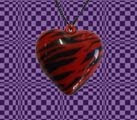
I wanted to include recognisable symbols so I then took a close up of a necklace used in the music video that I would place on the back cover of my DVD.

Thursday 17 December 2009

Photoshop- Developing my Back cover and spine

In today's session I carried on developing my back cover and spine on Photoshop. With the background already finished, I placed the title of the DVD and my bands name on the spine, in my chosen font with contrasting colours so it was readable. I then placed the DVD logo on my spine as it was conventional to a DVD another convention I added to my DVD was an ordering number I had to make up.
Moving onto my back cover, sticking to my plan I wanted to create a Keyboard outline of keys/notes on the side of the cover which I will then place the track listings on the individual notes. Do create the Keyboard notes I had to use the 'Rectangle Tool' with a white background to create a base, then used the tool again but changed the colour to black and made the shapes smaller so they were the notes on the keyboard. With the notes made I then added in my track listings in-between each notes. I used a different font to make it more readable and create an effect that someone has personally wrote the title on. The font was different from my front cover and spine but used the same colours as the spine to keep the colour theme.


I then added conventional symbols such as my record label logo, DVD logo and compact disc logo to the bottom of my DVD back cover. I also placed a bar code at the bottom and the written information about copyright etc at the bottom too. Finally, another convention to the back cover is websites so I create an address for my bands official website and also placed the record company's website below the bands website.

I am now planning to take photos of my band and necklace used as iconography to carry on finishing my back and front cover.

Wednesday 16 December 2009

Photoshop- Developing Front Cover, Back Cover and Spine

I will be using Photoshop on the Macs to produce my Digi-Pack- I will be producing a DVD Front and Back cover, an inside cover for my DVD and a magazine advert for my digi-pack, I may later produce additional materials using Photoshop if I have time.
During today's session I created three canvases for my front cover, back cover and spine (which I then plan to flatten and piece together in one canvas). To create my background for the DVD front and back cover I used the 'Pattern Stamp Tool' and chose a pattern that was black and white checked squares. I chose this as my research proves that this is a common convention to the Ska genre. I then used the 'Brush Tool' with a shade of purple to go over the checked squares- to make it effective I needed to change the 'Opacity' of the tool from 100% to 33%, so you could still see the checked squares. This is the background for my DVD front, back and spine, I am also planning to use this for my magazine advert and other marketing materials as a running theme in my Digi-Pack and Adverts.

Carrying on a iconography from my music video into my Digi-Pack and then added another layer to my front cover canvas and used the 'Pattern Stamp Tool' choosing a Jig-Saw piece as my stamp and placed one in each corner of my front cover- choosing the same pattern as my background. Also like my background, I used the 'Brush Tool' choosing four different colours and went over the stamp changing the opacity so you could still see the stamp- I wanted to create a spray effective and achieve this through using a brush.
I then placed the title of the DVD album at the top with my chosen font- I chose the colour yellow of the font to make the title stand out and contrast the background. Like my plan I want to have the name of my band 'The Madettes!' coming out of a trumpet- so I had to create individual text boxes and place them on the layer in a shape that conveyed the name coming out of the trumpet. I chose to have this in orange font as it worked well with the yellow title and also contrasted the background of purple.

Tuesday 15 December 2009

Research into similar marketing ideas and represenation for bands/artists

While researching into the Ska genre I researched into a modern Ska band and artist relevant to the music industry at the moment. 'No Doubt' were very significant to the Ska genre movement as they brought the genre of Pop into Ska and to a mainstream modern audience. I also looked into the marketing for the main singer of No Doubt who is a solo artist herself- Gwen Stefani.

I want to merge the Pop genre with the Ska/2Tone genre for my band 'The Madettes' and feel that the marketing ideas behind these acts are extremely successful and I want to echo the success with my band.

DVD Inside Cover- Planning


This is my uploading of my inside cover of my DVD, I have continued to use checked squares and bright colours for the inside cover. I am planning to insert still shots into the left hand side of the DVD cover to continue to market my music video throughout the marketing package. Symbols and iconography related to my band will also be used in the inside of my cover.

DVD Cover and DVD Back Cover- Planning


This is my uploading of my plan for my back and front cover of my DVD. I have decided to conform and challenge my genres conventions when planning my DVD cover and back cover. I have used the running theme of checked squares throughout my marketing package and decided to use colour to bring the genre up to date and to a modern audience. I have used musical instruments on my cover and a piano outline on the back cover to show the musical side to my band. I have used iconography from my music video such as jug-saw pieces and the love heart used on the back cover- to continue my running themes and to give the audience a sense of familiarity with the music video and DVD. I have followed classic conventions to a DVD with the logo, information and so on.

Magazine Advert- Planning


This is an uploading of my plan for my magazine advert used to advertise my Digi-Pack. As you can see I have used the Rig-Saw pieces in the corner of my mag advert which I have also used on my Front Cover of my DVD, continuing my thematic style through my Digi-Pack. I have also used checked squares to show the conventions of the genre of Ska. There will be a silhouette of the band in the centre of my advert- which will be used as the main image. Sheriece will be in a black silhouette where as, Stacey will be in a white silhouette- this is following Ska conventions with the use of colour and also using a silhouette was a common convention when analysing CD covers of Ska artists/bands. The title, band name, release date, website and format of the release with further details will also be on the magazine advert.

Ideas for Marketing Package- Planning

Throughout my marketing package I am going to use some Ska conventions I was made aware about from my research into the genre. The conventions I am planning to follow (influences gained through the album covers I have textually analysed) are silhouettes and checked squares, however I am planning to modernise these conventions with the use of colour to appeal more to my target audience. I am going to also gain inspiration from my music video and use the style and imagery of the rig-saw pieces which is seen at the end of our video. I have decided to plan to use bright and neon colours throughout my marketing package to show the progression of the Ska genre and bring the genre to a new and modern audience. The use of bright and neon colours might hold connotations of pop, funk and new rave for my audience; although my bands genre of music is Ska I have decided to go against the use of black and white in the marketing package.

Research into similar marketing ideas and represenation for bands.


While researching into my chosen genre and target audience I have decided to take influence from the pop rock band The Noisettes who are on the same parent record label as my band - Universal Music Group but not on the sub-label of Island Records. I want to appeal to the same audience that the marketing ideas for The Noisettes appeal to- teenagers and students. I also feel that The Noisettes have elements of retro style in their band and feel 'The Madettes' are being retro with the genre they are- Ska band.

When producing my marketing materials for 'The Madettes' I will keep The Noisettes in mind and their appeal along with marketing materials produced for their band.

Sunday 13 December 2009

Chosen font to use- Planning and Research

The chose of font I have decided to use is ‘Phorssa’ which I downloaded from www.dafont.com to use for my marketing package. I have decided to use this font with bright/neon colours as it communicates the indie pop genre. Although my genre is Ska this is what I want to achieve when bring the genre and breaking the conventions for a modern and new audience. The font connotes a girly punk attitude- the font is also similar to a font that has been used in the past for the Sex Pistols.

Saturday 12 December 2009

Band/Marketing Image - Planning

I want to communicate to my audience that my band is about music and image appealing further to my target audience. I am planning to show this through the use of instruments not only in my music video but on the front cover of their album. I also want to show that ‘The Madettes’ are fashionable and have an appealing image. I am going to use the love heart necklace as a symbol relate to The Madettes and I am going to feature it on the back cover of the album- with an image of it and then a symbol besides the record label.


Wednesday 9 December 2009

Magazine Music Adverts- Research

This is a second magazine advert advertising a bands CD album which I have analyzed for research when constructing my own magazine advert for the release of my bands 'The Madettes' DVD album. I felt out of the magazine adverts that I could have analysed this had elements most like the elements I would and want to be using when I produce my DVD magazine advert. The main image on the magazine advert is the artwork to the bands CD album giving the audience an idea of the genre and what they would be purchasing. Through the style of the conventions on the advert the genre that is portrayed is Electro/Indie rock- through the image and white font style and background I think the genre is portrayed well. The band may have a range of genres that they may fit into as the colour font with the album title is communicating a New Rave genre to me. There is conventional information on the advert- websites, record label, release date, release of format, band name and title of bands album.
I want to use elements used in this magazine to create my advert for example the contrast in background to the image, the conventions showing different genres I am interested to in experimenting with particular the use of font.

Tuesday 8 December 2009

Magazine Music Adverts- Research

As part of our marketing package research I analysed two magazine adverts advertising for a release of an album. I was unable to find an advert with the genre of music being advertised the same genre my band full into Ska- so I analysed two contrasting adverts. This is my first advert that I textually analysed, advertising the album '9' by Damien Rice. The advert features reviews from a range of sources- newspapers to magazines, this maybe communicating that this album is critical acclaimed by a range of reviewers. The advert also features the conventions of a website and record label logo- for the audience to find more info about the artist if they wished. The colour of this advert comes across plan but sophisticated showing that the sound of the album might be mature and easy listening. There is an image in the bottom left- this is the front cover of the album by Damien Rice. The front appears like it has been hand written- communicating that Damien might be a singer songwriter who has wrote the song on his album. I feel the advert is effective as it appeals to its target audience of easy listeners, indie/folk rock and mature listeners.

Saturday 5 December 2009

The Veronicas CD Covers- Research


A personal influence when planning my marketing package were the female pop rock duo The Veronicas. I decided to personally research into their marketing and in particular their albums artwork, and from their album artwork I have gain influences from and ideas for my marketing package. As you can see The Veronicas have a checked squared theme running throughout all their album covers and back covers this is an influence from the Ska and 2Tone genre, so it shows how influences can be brought to the mainstream modern audience and genres are constantly challenging themselves. Also I find the use of colour effective as all the covers are dark but with light colours and some with neon colours. I want to carry the neon colours and checked square theme throughout my marketing package and I want to target an audience like The Veronicas target audience. I will be conforming to Ska conventions however I will be challenging them as I want to revive the genre for a new modern audience in particular a female audience.

Friday 4 December 2009

Ska CD Cover- Research


The last Ska album I have decided to textually analyse when undertaking my research is a Ska compilation album. I have decided to analyse a compilation album because I wanted to see how the conventions in the genre and different artists/bands would be brought together. As you can see the use of black and white is a clear convention of the Ska genre. This album has also used another colour- orange in its package- this could be showing a slight modernisation to the genre or a progression in the genre. I am attracted to the use of font that they have used for the word ‘SKA’ in the title and I would like to find a font similar to use in my album design. The main image of the cover features a black and white photo of a man playing an instrument which is commonly used in Ska music; the audience can also see the costume that is associated to the genre.

Thursday 3 December 2009

Ska CD Covers- Research


This is the second album cover/back cover I have textually analysed when researching into the Ska genre to gain inspiration and be made aware of the conventions to this genre. Once gain there is the running theme of the use of black and white, however there is a use of red font colour- this might be because they want certain information to stand out or to show a progression in the genre or to show that this band ‘The Specials’ is doing something original with the genre of Ska. There is another silhouette used in this album cover telling me that this is a common convention amongst the Ska genre. The black and white checked squares are used again on the back of the cover- along with the common conventions of an album back cover. There is a main image of the band on the front cover once again suggesting that they want to be original and different with the genre as most Ska genre albums don’t feature an image of the band. I find the integration of black and white effetive on the front cover suggesting that all races are equal and ‘The Specials’ welcomed black people into Ska.

Ska CD Cover- Research


I have begun to textually analyse the genre of Ska/2Tone artwork for the artist/bands album covers and back covers, to gain an understanding of the conventions from this genre to use when creating my marketing package- mainly my DVD cover and back cover. As you can see I have decided to analyse The Selecter’s album ‘Too Much Pressure’. The genre of music is directly told to the audience through the use of the symbol in the left hand corner on the front cover ‘2Tone’. The colours of only black and white are used on the back and front cover of the album- which is a common convention for the Ska genre. Another convention of the Ska genre and a convention which I want to use is the checked square- there are black and white squares running throughout this marketing package. I find the silhouette on the back cover effective and I would like to gain inspiration with the use of silhouette from this album, and use it in a different way/style for my band. There are the common conventions to a back cover of an album- record label, track listings, website etc. I feel this album cover is effective as the audience will know the style of the music from the conventions, with it sitting comfortably in the Ska/2Tone genre.

Wednesday 2 December 2009

CD Covers- Research


During class time we textually analysed the music artist Jay-Z's current album 'The Blueprint 3' shown beside, we also analysed his previous album covers over his career to see the change in Jay-Z image and representation as an artist. Studying this artwork we as an audience can see a change in reputation as a mainstream artist, at the start of his career where he has very little control if not any say in how he is representation- he is portrayed with a thug look and close-ups of him, this makes the audience feel slightly intimidated by him. As Jay-Z becomes more successful as a recording artist we see his albums and image develop. This latest album becomes less about his image and more about his music! This is because Jay-Z has more of a creative control over his music and representation. He has become more mainstream and popular showing that what Jay-Z is doing is sell-able. Jay-Z seems to have more control over this now rather than at the start of his career where the record label had all the control. Jay-Z has become a producer not only for himself but for other artist and is more creditable in the music industry than ever before. Is it obvious that Jay-Z wants to bring it back to basic to the music, he wants the audience to forget his image for a second and focus on his sound his music. I feel through this album Jay-Z has gained more respect as an artist.
This is successful and effective for Jay-Z but will be hard for a new band or artist to achieve with the audience having little awareness of who they are. I want a mix of image and music representation for the overall marketing package of my band 'The Madettes'.

Tuesday 1 December 2009

Record Label Choice


The chosen record label for our band 'The Madettes' is Island Records UK part of the Universal Music Group. I was attracted to the chose of this label as one of my influences for the bands image in signed to Island Records and that is VV Brown. There is a range of diverse music genres on this record label which influence my chosen genre of music- Ska/2Tone, this record label is also a mainstream record label so it would be able to help with the marketing of my band. When personally researching into record labels I found out that this label was founded in Jamaica just like my genre of music Ska. I felt this direct link and my influences is a successful choice of record label for 'The Madettes'.

Wednesday 11 November 2009

Research: Direct Modern Influence For My Genre And Work


This is an uploading of a music video from a modern Ska influence, that directly influenced me
while creating my main product but also my ancillary tasks. This music video "Just A Girl By No
Doubt'" I found to be very similar while analysing the music video of "Baggy Trousers By
Madness" as the performance is very much alike and the band perform inside a house just like
in the music video "Baggy Trousers". This also added to my understanding of the conventions
into the genre and the modern conventions of the genre.

Tuesday 10 November 2009

Uploading and Editing Sheriece Dancing

In this session as me and Sheriece had a free period so we decided to upload our footage that we had filmed from the previous session of filming. After we uploaded the footage we began to edit the footage like normal on Final Cut- we wanted the shots all on the screen so the audience could see them at the same time and again to make it more 'mad' (as the audience don't know where to look on screen). So Sheriece made the clips into 3 different ones on screen at the same time.

Monday 9 November 2009

Shooting Main Singer Dancing- Filming

Me and Sheriece decided in our free period to record the main singer (Sheriece) dancing as we felt that our band members were not very mad and we needed to show why the group was called The Madettes. I filmed Sheriece without a tripod so it was handheld and on a low angle birds eye view, I filmed her in a long shot with her whole body in view. We decided for Sheriece to be wearing colourful odd socks to add to the 'mad' theme for this section. I filmed three takes of Sheriece doing different things in each shots- one was dancing, one was walking backwards and fore-wards and the other was running up to the camera and waving to the audience.

Editing with effects

As a group we decided that our music video lacked a range of effects and it would be more appealing to the audience with more effects and it would also go along with the title of our band 'The Madettes' if we added some crazy effects into the video. We decided to break the conventions of Ska and 2 Tone music genre as we have played around with the use of colour in our music video- while using the tool on Final Cut which is the colour corrector. We also added the effect of the super imposition over a clip of the main singer in the recording studio, again to make it me appealing to our target audience and modernise our genre for today's audience.

Friday 6 November 2009

Editing

We began editing the second chorus of the song, we decided to spilt the screen up into four different sections showing different clips at the same time- this follows our square theme throughout our video. We decided to do this as it will be more interesting for the audience watching the video- as they will have four shots to look at, at one time.

Tuesday 3 November 2009

Uploading the Band with Instruments- Editing

We upload our footage of our band playing the instruments in today's session, we were pleased as a whole with the footage that we have recorded and pleased that we have shots with the band performing together as it is a convention of Ska music videos. Through watching back the footage we were made aware how we could use the crop tool on Final Cut to achieve what we planned to achieve- with Stacey appearing on the right and left of Shereice.

Shooting Band with Instruments- Filming

As a convention of Ska music videos we decided as a group to record footage of our band playing musical instrumentals in a range of shots- including close ups, long shots and extreme close ups. We decided to have the main singer holding a mic as a prop and Stacey the member of the band to have a guitar and saxophone- we recorded Stacey in close ups playing these instruments.

As we decided that we would have 3 members in the band and two of them will we twins- we will need to edit the footage on Final Cut and crop the shots to make it look like Stacey is present on the right and left of the main singer.

We used the tripod and FIG-RIG to experiment with a range of shot types to make our video more appealing and pleasing to the eye of the spectator.

Monday 2 November 2009

Uploading the Re-Shooting in the Studio- Editing

To continue our progress in the editing stages we spent this lesson uploading the footage from our previous recording session in the studio, re-shooting the main singer Sheriece. We decided while this footage was being uploading that we would plan to experiment with the use of effects in our music video to make the video more 'MAD' like the title of our band 'The Madettes'.

Wednesday 21 October 2009

Re-Shooting in the Recording Studio- Filming

Today after school, Me, Sheriece and Tom re-shooted in the recording studio as the shots we recorded previously did not reveal the main singer successfully and the main singer wasn't in the appropriate costume that a 'star' would wear. Sheriece wore the appropriate costume for the main singer as her costume followed the conventions of Ska female artists- wearing smart black, white, grey clothes. However, because we want to push the boundaries of this genre and modernise Ska for a modern audience she wore a bright pink scarf and cardigan to achieve this.


We set up the location so it would look professional for the audience when viewing the music video, we recorded various times in different positions with the camera. We recorded in a mid shot of the artist with the camera on a tripod, we recorded in a low angle/worms eye view with a slight up tilt with the camera just on the floor, we also used the FIG-RIG to record the artist singing using various close ups and mid shots. Other shots included hand held long shots, hand held mid shots and we placed the camera above Sheriece with a slight high angle/birds eye view. We decided to use a variety of different shots as the recording studio would be the audiences main focus within the video as we would use shots from this repeatedly throughout the music video. Another reason we used various shots was to make it more appealing, interesting and unique for the audience.

The lighting in these shots was minimal as we used the lighting in the room- I felt this was effective as the lighting was directly above the artist. The lights were small flood lights that appeared to look like small spotlights because there were a variety of them the lighting achieved was appropriate and effective for these shots.

I was extremely pleased with this recording session as we filmed about four takes using the camera in different positions and experiment with the camera positions and settings (e.g. night vision). The main singer- Sheriece also acted effectively and looked like she was performing.

Uploading and Began to Edit

We upload our footage from the last lesson to see if these shots were successful and effective to use in our music video, from seeing the clips we were aware that lighting was a problem in the close up shots of Sheriece singing the chorus in various positions. This was because of the shadow and because the lack of natural lighting. We have decided to re-shot this section next lesson.

After viewing and trying to edit our male actor running on a plain white wall, we were aware that the Chromo Key effect could not be achieved, again because of the lighting within this shot but also because of the characters costume wasn't completely contrasting enough for the effect to be achieved. Shadows was another factor that stopped us from achieving the most effective shot that we could have achieved. We have decided also to re-shot this section next lesson.

While re-shooting these two sections, we have decided to use a powerful light source of 100Ws. To overcome our problem with the lighting and the shadows.

Shooting Chorus and Extra to be edited with Chroma Key -Filming

During today’s lesson Me, Sheriece and Tom filmed two sections that we would use within our music video. Firstly, we were fortunate to have a male actor who was willing to do what we directed him to do. We filmed him running in front of a plain white wall, in a long shot so that Tom could edit this shot with the Chromo Key which would mean we would lose the background and just have the actor- so we could use him running through other shots at various sections of our music video. We found that we had some slight problems when filming this section as we were unable to see the whole body of the actor running. We then decided to do the same shot but on a smaller wall so we could just crop the sides to show a white wall.

We also record four shots of the main singer Sheriece in close ups that we could use in the chorus of the song, we sang directly to the camera firstly, then to the left, then to the right and then she sang looking down. We aim to edit these shots into four separate squares to create the illusion that she is singing to herself from different parts in the screens.

Sunday 18 October 2009

Final Cut- Editing

During today’s lesion we continued to edit with Final Cut on the Mac- during this session we began to edit and experiment with the opacity of the shots we have of the main artist in our music video. We used the opacity of the shots to reveal the artist singing and also show her foot tapping at the same time. While we were doing this it made us aware that we would need to re-shot in the recording studio to show the main artist ‘performing’ more.

Shooting ‘All the teachers in the pub, passing round the ready rub’- Filming

As we have previously used stop-motion in our music video with other shots successfully we decided to shot more in this technique, we decided to shot in stop-motion for the line ‘All the teachers in the pub, passing round the ready rub’, showing the drink going down as if the teacher was drinking it and also showing the drink going back up (however with the drink going back up this could only be achieved when editing).

Sheriece went outside of school to a nearby restaurant and with an actress we have already asked to be in our music video, filmed a close up of a glass and bottle of alcohol- so the main focus was the glass and what was in the glass. The camera was also placed on the table where the glass was showing it was at the same level, I felt this was extremely successful when watching it after being uploaded and feel stop-motion could be used more within our music video.

Final Cut- Editing

In today’s lesson we continued to edit our footage, during the editing process we started to experiment with splitting the screen into four sections that had four different clips- this would be more interesting and engaging for the audience to watch rather than just one shot. This also fitted well with the beat of the music- this was our main reason behind the reason of doing this. The four shots showed the close up and point of views of the headmaster and band members. We gained inspiration for this opening from a music video by The Specials called ‘Gangster’. The effect we altered to achieve this section of our editing was the super composition.

Using the colour corrector we experimented with the beginning of the video so we created four squares- two black and two white. This is also a common convention of a Ska music video because of the use of black and white; we gained inspiration from another video by The Specials. Throughout our music video to modern the Ska genre for our current, modern audience we have gone against the conventions of Ska music but we have also followed various conventions and this is one.

Wednesday 14 October 2009

Emailing to book a filming location

Below is an email I sent to a Music Technician to book the Recording Studio for a re-recording session.

RE: Booking Recording Studio
Sam Luffman
Sent:14 October 2009 11:28
To:M Julian Fagan-King

Hi Sir,
Yep thats cool- just need you to set up the equipment in the recording studio for us. THANK YOU SAM

From: Julian Fagan-King
Sent: 13 October 2009 11:28
To: Sam Luffman
Subject: RE: Booking Recording Studio

Hi Sam, This week is a no! But next week is alright afterschool on wednesday?
Julian Fagan-King Music Technician Glenthorne High School

From: Sam Luffman
Sent: Tuesday, October 13, 2009 9:29 AM
To: Julian Fagan-King
Subject: Booking Recording Studio

Hi Sir, Its the Baggy Trousers music video group - just wondering if we could re-shot in the recording studio sometime after school (not recording vocals just with camera) as some of our footage isn't useable. Could you let me know when you are free any time after school (or during school)?

Thanks SAM

Friday 9 October 2009

Final Cut Part1- Editing


During today's lesson we began to start editing our work on the Mac computers in a programme called Final Cut. We uploaded our work and began to start editing the start of our Music Video we also placed shots later on in the song that we had filmed. As we have not had a tutorial with Final Cut yet me and Sheriece were unaware how to use the programme but Tom has used the programme before so he was able to show us and guide us. We added checked squares to the intro of the song- we also added a vibration effect to the fire alarm to make it look like it was moving. As this was the first time we got to see if the song matched and went well with the filming we had done - we were pleased as a group with the process so far.

Thursday 8 October 2009

Uploading

We began to upload our footage today as we felt we have got to the stage where we could start uploading- this made my group aware what shots we have recorded, and what shots we still need to shot. While uploading we also noticed various shots that weren’t particular effective for example shots of the lead singers weren’t as revealing and focused on the lead singer as possible, so we are going to re-shot this with more interesting angles and effective shots. The uploading also gave us an insight into how the work was all piecing together.

Wednesday 7 October 2009

Uploading

During today’s lesson we beagn to upload our footage on our three tapes onto the Macs through iMovie and then we transferred and copied it over to Final Cut. Uploading our footage revealed what we have filmed so far in the process, it also gave us the awareness what shots we could and what shots we couldn’t use in our music video.

Shooting "Headmaster's Breaking All The Rules"- Filming

During today's lesson Me, Sheriece and Tom went to record various shots that had the headmaster in- so we could use one for the line "Headmaster's Breaking All The Rules" and other shots that the headmaster would be present in. Sheriece brought in the prop of sweets and I brought in my costume for the headmaster, for this line we wanted the headmaster relaxing in a staff room environment with his feet up on the table eating sweets (basically breaking rules). We took various shots of these to experiment what shot would be the most effective- we recorded on a tripod over the shoulder shot to create an effect someone was watching him, low angle to give the headmaster status, a reflective shot to make the shot more interesting and various other experimental shots.

Shooting In The Corridor- Filming

After uploading and watching back our recorded footage from the last session we decided as a group that the shots we mainly done with the camera mounted on the FIG-RIG were the most effective and appealing. We created a hand-held effect but the shots appeared more smooth and not as shaky, also the actors faces were looking directly into the camera so it showed the actors interacting with the audeince. These shots were all effective and visually pleasing as it added to the range of angles that we used.

Monday 5 October 2009

Shooting In The Corridor- Filming


In today's recording session we decided to experiment by using the FIG-RIG, we placed the camera onto the fig-rig so we could hold both sides of the wheel. We recorded shots of Myself, Sheriece and Stacey sitting on chair (we decided to record these and then in the editing stages decide what shots we would use). We recorded in 1st person- I used the Fig-Rig for a line in the song that refers to the head-teacher. We also recorded by placing the camera on floor level recording peoples feet in the shot.

Thursday 1 October 2009

Shooting Around School- Filming

During today's filming session we recorded a hand held shot of a fire alarm, that we would add an effect to, to show it is ringing. We also shot an extreme close up of Sheriece's eye that we would use in our music video. The final shots we recorded today were a hand held shot of a key hole that was an extreme close up and we also recorded this shot on a tripod to see what shot was more effective for what we wanted.

Wednesday 30 September 2009

Shooting In The Headmaster's Office- Filming

In preparation for this part of filming we created 4 posters that were used in shots and during this filming period- they read, "Detention list", "Students to Cane list", "How to Cane" and "Student Discipline". During the filming process we shot in a location relate to our lyrics "Sits alone and bends his cane" so we decided to shoot in our headteacher's office. We place the lyrics on a wall around the office, we used close ups on these titles and also the information on the posters.

We decided to use hand held shots when we were in the office so we could also use panning around the room to reveal the location until we got to the posters. We also tried to film a singer on the headmaster's singing while turning on the chair however this was unsuccessful.

Tuesday 29 September 2009

Shooting "Smashing Up The Woodwork Tools"- Filming

Today we filmed footage in the woodwork room at our school- for the line 'smashing up the woodwork tools' for this we shot in the technique of stop motion animation by moving the tools slightly in one shot and moving in further in another. This created the illusion that the tools were moving on there own. The type of shots we used were high angle and eye line match, we also placed a comical character of 'zippy' in the backdrop to make it humorous and the shot more interesting.

Monday 28 September 2009

Booking Rooms and Actors-Planning

During todays lesson we have confirmation from our head teacher who also will be playing the head teacher in our music video that we will be able to film him on Tuesday 29th September, and also will be able to use his office on Wednesday 30th September. We have also booked a woodwork room to be used Tuesday 29th September during period one in school. In preparation for this we need to make sure we have organised our props and well as making posters. We have also booked a FIG-RIG with Mr Winters (our media tech) .

Shooting In The Playground and Establishing Shots -Filming

In today's shooting session, Myself, Sheriece and Tom decided we would shoot in the playground and also outside school for footage. We decided to follow our storyboard and have a ball bounce across the camera screen. We experiment with this shot by placing the camera on the floor and bouncing the ball at the camera but making sure the ball bounced over it, however this was not effective so we decided to record a long shot of the ball bouncing across the screen with the camera on a tripod.

We then filmed the establishing shot of our school sign in a close up, we are hoping to change the school sign to have another name over it on the Mac Computers in the editing stages with Final Cut.

Shooting In The Recording Studio- Filming

As we needed to re-record a female version of the title song 'Baggy Trousers' we decided to film most of our video in the recording studio. Myself and Tom recorded Sheriece and Stacey singing into the recording mic in three different shots, the camera I was filming from was in a mid shot. We also used a handheld camera to get a moving shot effect that is common in all music videos.

We continued to film over another session, however this time Tom filmed the technincal equipment while I continued to film shots of Sheriece and Stacey (the band). The main focus was to record the girls singing so that we could use their verison of the song and break conventions of the genre by using all female Ska band.

Shooting Schedule

Here is an uploading of my shooting schedule-


Sunday 27 September 2009

Storyboards- Part 4

Final uploading of our storyboards- finished timing and edit types for the frames included.


Storyboards- Part 3

Part 3 of uploading of my group's completed storyboards- one more post and all storyboards will be completed.


Storyboards- Part 2

More of my groups completed storyboarding.


Storyboards- Part 1

Below are uploading of my groups finished storyboards with all information on needed for filming.