Final Product- Music Video

Wednesday 27 January 2010

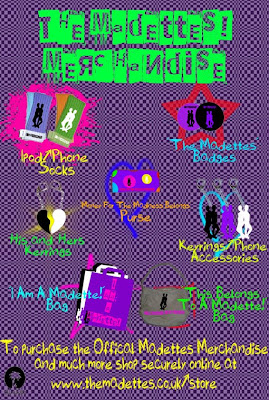
The Madettes! Merchandise Advert

This is my final piece marketing material from my ancillary task, I have created another advert advertising merchandise for ‘The Madettes’ to be purchased. I have taken various photos to then be uploaded and edited in Photoshop, I took photos of my Ipod socks, one big badge, key rings, purse and bags. This again is appealing to my chosen target audience as these accessories and different forms of merchandise prove popular amongst them. During the editing stages of these photos I used colour overlay on the products, placed a brand name or title over the products and used the recognisable silhouette on the products.

I have kept the same conventions I have used for my other adverts for further merchandise for ‘The Madettes’. I have placed the title, name of the products, photos of the product and where you can purchase the product from. The same font and background is used making my entire promotional materials one big marketing brand.
Tuesday 26 January 2010

I Am A Madette! Make-Up Range Merchandise Advert

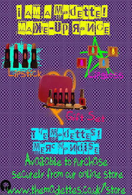
I decided to branch out with the ‘I Am A Madette!’ brand and product a make-up range for my audience. I know that this would be successful as it appeals directly to my target audience- they wear make-up and having a make-up product by a girl-band will make them ‘edgy’ and ‘original’. I have uploaded my make-up range advert much like the other posters I went through the same process. I took photos of lipstick, lip-gloss, and a jewellery box that I would sell as a make-up box and other make-up products used in my gift set. I used the magic wand tool on Photoshop to edit out the white background on these pictures, so I would just have the product on its own. I then placed a variety of different coloured silhouettes of my band members on them- which would make them more sellable.

I have kept the same conventions I have used for my other adverts for the ‘I Am A Madette!’ brand. I have placed the name of the make-up range, photos of the product and where you can purchase the product from. The same font and background is used making my entire promotional materials one big marketing brand.
I Am A Madette! Jewellery Range Merchandise Advert

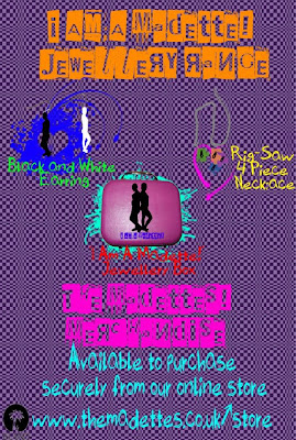
To continue the ‘I Am A Madette!’ brand for my band, I have decided to produce a jewellery range for my target audience. This is an uploading of my band’s jewellery range advert. I took photos of earrings, a necklace and a jewellery box- I then uploaded them onto the computer and edited the photos in Photoshop. I used my bands logo of the black and white silhouettes to create the earrings- I used the ‘magic wand tool’ to delete the charm on my original photo of the earrings and kept the top piece of the earring. I then placed the silhouettes under the piece of earring I had left to create this product. I placed a black silhouette of ‘The Madettes’ on the photo of the box and wrote the brand title as well. Finally, for my necklace I wanted to use the jig-saw theme I have in my Digi-Pack, so I copied the rig-saw pieces from my front cover and then placed silhouettes on top of them. I edited the photo of the necklace much like the earrings by deleting the charm and keeping the chain.

I have kept the same conventions that I have used on my other promotional material for my band to make it identifiable and as one whole marketing package. I have placed the name of jewellery range, photos of the product and where you can purchase the product from.

Monday 25 January 2010

I Am A Madette! Clothing Line Merchandise Advert

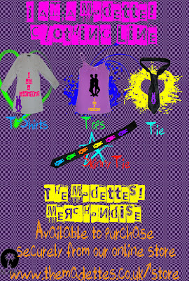
This is an uploading of my band’s clothing line ‘I Am A Madettes!’ advert for my bands merchandise. I took photos of clothing items including a white t-shirt, purple top, tie and skinny tie- I then uploaded them to the computer and edited them on Photoshop. I decided to create the clothing line ‘I Am A Madettes’ as I feel my target audience would aspire to be like ‘A Madette’ and this is one way they can feel part of ‘The Madettes’. I have placed the bands identifiable logo on the items of clothing to make it identifiable for my fans and more personal for the aspiring member of the audience.

I have kept the same conventions that I have used on my other promotional material for my band to make it identifiable and as one whole marketing package. Many pop/rock girl bands have merchandise like these items I have decided to create. I have placed the name of the clothing line, photos of the product and where you can purchase the product from. I will also create other merchandising materials for my target audience as this kind of marketing works with the promotion of my band and audience overall.

Friday 22 January 2010

The Madettes Tour Advert

Along with my Digit-Pack of a DVD cover and Album advert I have decided to produce other marketing materials to include in my marketing package as a whole. I have produced extra marketing materials for my band as it is another effective way of promoting my band as a whole and my bands products. All my marketing material appeals to my target audience and the merchandise behind my promotion is visually attractive to my target audience. I have used my theme of checked squares and purple background throughout the promotion materials along with the same font bringing together the whole of my music package. The music package also includes all necessary conventions for example the bands name, details of all the products and where you can purchase them, event details, record label and similar iconography throughout.

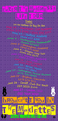
As advertised on my album promotional advert I have included information about a promotional tour that my band ‘The Madettes’ will be doing a couple of months after the release of their debut album (which is quite common amongst artist/bands), so I decided to produce a tour poster. I have again stuck with my conventions I have used on all other material and also show the conventions to a tour poster which include- the tour dates, venues my band will be performing in, venues box-office phone numbers, how to buy the tickets, title of tour, band name and website.

I researched music venues carefully as I wanted my band to perform in the right venues, appealing to the right away. The type of venues that I have decided to chose are venues that our popular amongst the student demographic- part of my audience that this band will appeal to. I have decided to get my band to perform in smaller venues as this is their first mainstream tour and most artists/bands start off with small venues.

I have kept the similar visual style to my tour advert as I have in my other products to make an effective overall marketing package, which will appeal and will be recognise by my audience.

Wednesday 13 January 2010

The Madettes DVD Disc Label

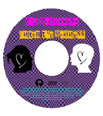
Along with my DVD cover and inside cover I have produced a DVD label that would be mounted onto the DVD in the production stages of making the DVD. This DVD label stemmed from ideas during the planning stages of my inside cover. I took two pictures of close ups of Sheriece and Stacey and then added a colour overlay on both- black and white the conventional colours of the Ska genre. I then downloaded an appropriate heart vector/brush from the Internet available in the public domain, I chose black and white again but used them on the contrasting colours of the band members. I kept the same background that I used on the DVD cover and inside covers. I placed my record label and DVD symbols onto the DVD label along with the copyright information in a different colour as it would stand out in contrast to my background, as this is a convention of a DVD disc. I have used the font and colour of the font throughout my Digi-pack so to keep to the theme of my Digi-pack I decided to use it on the DVD disc label too.

Tuesday 12 January 2010

Photos taken to be used on my DVD disc label


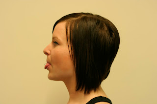
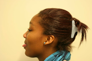
During today's lesson I decided to create extra material to the task set, I decided to produce a DVD Disc label that would be mounted onto my DVD in the production stages of making the product. I wanted to include my bands members on the disc- I took a variety of shots of the members long shots face on, mid shots face on and then close ups side on. After uploading these photos I decided the most appealing photos that would work with my intentions would be the close ups side on photos (above). I followed my plan for this and directed Sheriece and Stacey to stick their tongues out- so when I create the Disc label it will look like they are sticking their tongues out at each other. I wanted to show that the band doesn't take itself too seriously and knows how to have fun, trying to convey the 'mad' feel to the image of the band.

Friday 8 January 2010

The Madettes DVD Advert- Creating my magazine DVD advert- Photoshop


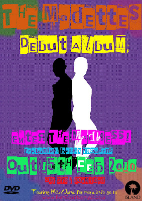
In today's session I created a magazine advert advertising my DVD, I kept the same background I have used for my DVD front and back cover so I copied the layer over to a new canvas that was the size of an A4 piece of paper. I then used the stamp tool and placed the rig-saw pieces in the corner of the advert, I then went over the jig-saw pieces with different colours using the brushes. I wanted to keep this theme throughout my Digi-Pack. For the main image of my band on the magazine advert I decided to use the same silhouette I used on the front cover from my DVD (relating and drawing a link between the two) but changed half the silhouette to black and the other to white- showing the Ska genre as it is a convention of the genre.

After creating the background and silhouettes to the advert, I then started to include the conventional information and symbols that needed to be on the advert. I placed my record label logo on the bottom right hand side and a DVD logo on the left. I kept the same font as on my DVD cover and included the bands name and title of the DVD. I also included additional information that would be needed such as the release date of the DVD, release formats and websites. To make the advert more appealing to the audience I included information about the lead single being on it and also that it is the bands debut release. I have also included details about a promotional tour that 'The Madettes' would be doing after the release of their album.


The Madettes DVD Inside Cover- Photoshop


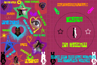
This is my finished DVD inside cover. I have decided to draw on the element of rewarding the audience- giving them something when they open the DVD and I feel this inside cover achieves this. For the background of my inside cover I have decided to keep the checked squares effect that I achieved from using the stamp tool- however, I wanted to change the colour of the back ground from purple to pink as I wanted the audience to have something visually different to see but it is still familiar.

For my right side of the inside cover I have drew where the DVD would be presented in the centre, I have used the silhouettes as iconography for the band so the audience would recognize the symbol to the band. I then used the stamp tool to place two stars on the outline of where the DVD would be- one white and black linking to my Ska genre. I have used the same font but changed the colour so it is readable and communicates a modern Ska genre of my target audience.

For the left side of the inside cover, I have gone for the 'busy' and 'in your face' effect drawing on the surprise effect when you open the DVD. I have taken screen shots from the bands debut music video of 'Baggy Trousers' and then taken pictures of my band members- close ups and mid shots. I have placed brushes I downloaded that our copyright free and placed them behind my photos and screen shots to make them stand out to the audience. The colours again are bright and neon as I want to modernize the genre as a whole. To fill the space on the left side I used more brushes to make sure I used the 'busy' effect on the whole left cover. I then wrote the titles of the songs in text boxes, finally I placed the band members names next to the photos of them- to introduce the audience to them individually.

The Madettes DVD Cover- Finished Front and Back cover


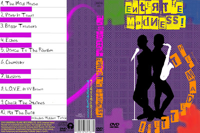
This is my final DVD cover, back cover and spine for the release of 'The Madettes- Enter The Madness!' DVD album. I decided to change and develop my draft 1 of the DVD album as I felt the back cover was a little too busy and I want to create the 'busy' effect when the audience open the DVD. I deleted the heart photo and silhouette on the back cover of the DVD and changed the piano I create and track-listings. I made the piano bigger so it was the main focus on the back cover and chose one colour which was pink instead of the pink and orange. I then decided to change the font colour and keys/notes on the piano- black to pink. I then inserted a light grey line so the notes looked separate and individual notes. Finally, to the back I decided to use a brush of a heart with a pink colour to it- I made it look like it was coming out of the piano and moved the layer under the piano.

The change I made to the front cover was on the bottom right corner- I changed the colour of the jig-saw stamp from light orange to red as I felt I needed a greater contrast to the colour of the title on the DVD cover which was orange.

I have developed my initial plan for the DVD cover and back cover when using Photoshop, as I did not use it before I learnt new techniques and developed my creativity along the way- which led me to develop my initial plan.

Tuesday 5 January 2010

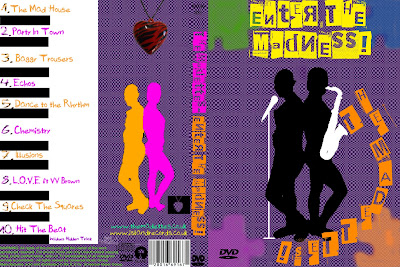
The Madettes DVD Cover- Draft 1 of Front and Back cover- Photoshop

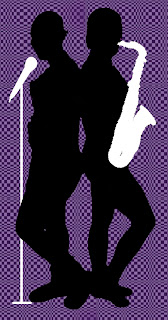
In this session I finished a draft of my DVD front and back cover. After creating a black silhouette on my front cover I used a downloadable brushes that were in the public domain to add final touches to my front cover. I downloaded musical instruments in the brushes set- I then used the 'Brush Tool' and chose the saxophone brush with a white tolerance of 50 and placed a couple over each other- so it produced a white silhouette of a sax. I then positioned the saxophone in the right place so my band's name looked like it was coming out of the sax. I then used the brush tool again and found a microphone brush- I changed the tolerance to 50 with a white colour to it- again looking like it was a silhouette of a mic. To create a mic stand I used the brush tool and used an appropriate size to create the stand. I then position the mic and stand together merging them and placing them next to Sheriece so it looked like she would be singing out of it.


To finish of my back cover I used the same silhouette of my band I used on the front cover by changed the colour overlay of it to a pink. I then wanted to make Sheriece a different colour so I Duplicated the layer and changed the colour overlay to orange. I then used the Eraser tool to rub out Stacey on this layer so final I got Sheriece in a orange silhouette and Stacey in a pink one together.