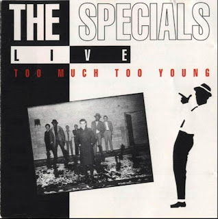
After analysing the genetic conventions I then continued to analyse a number of CD covers in the genre of 2Tone Ska, including ‘The Specials’, ‘The Selector’ and also a Ska compilation album. From textually analysing these covers I recognised the conventions of the genre- the colours of black and white were used, chequered squares were dominate and a clear convention in all covers and the use of silhouettes were a common convention of the genre. The fonts on all covers were bold and extremely eye catching from the audience.

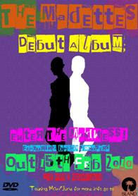
The 2Tone Ska conventions I followed for my DVD cover included the use of silhouettes- I took a photo of the band and change the colour overlay one to white and the other to black to use the convention of black and white as well. Another convention I used from the genre included the use of chequered squares however I decided to develop this convention by adding colour to the convention and developing it for a modern female audience in the age range of (14 to 18). The font I used was bold and eye catching like the genre of Ska but I decided to develop this further with bright colours appealing to my audience. My main idea to develop the conventions of the genre was the use of colour in my DVD cover. I then applied the ideas from my DVD cover to my magazine advert for the marketing of the product.
Here you can see the font and colours mentioned above -
You've clearly evidenced this! JIN
ReplyDelete