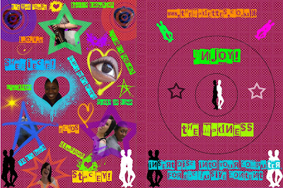
For my right side of the inside cover I have drew where the DVD would be presented in the centre, I have used the silhouettes as iconography for the band so the audience would recognize the symbol to the band. I then used the stamp tool to place two stars on the outline of where the DVD would be- one white and black linking to my Ska genre. I have used the same font but changed the colour so it is readable and communicates a modern Ska genre of my target audience.
For the left side of the inside cover, I have gone for the 'busy' and 'in your face' effect drawing on the surprise effect when you open the DVD. I have taken screen shots from the bands debut music video of 'Baggy Trousers' and then taken pictures of my band members- close ups and mid shots. I have placed brushes I downloaded that our copyright free and placed them behind my photos and screen shots to make them stand out to the audience. The colours again are bright and neon as I want to modernize the genre as a whole. To fill the space on the left side I used more brushes to make sure I used the 'busy' effect on the whole left cover. I then wrote the titles of the songs in text boxes, finally I placed the band members names next to the photos of them- to introduce the audience to them individually.
Nice connection to audience appeal. JIN
ReplyDelete